Checking access…
Checking access…
Network-native growth intelligence for enterprise app verticals — Ride Hailing, Food Delivery, Shopping, Banking, Insurance, AI tools, and more. Built on real operator engagement signals, Omni Enterprise tracks how categories grow, how brands compete within them, and where the opportunities are — delivered as an interactive dashboard platform and structured reports, refreshed monthly.

Omni Growth is a behavioural intelligence platform built entirely on live network observability data — not surveys, not declared panels. It tracks how mobile app categories and individual brands grow, compete, and reach their audiences across the operator's subscriber base, and frames every insight inside a rigorous Byron Sharp growth framework.
Every metric in the platform traces back to a single source: real engagement signals observed on the operator's network infrastructure. When a subscriber opens an app, makes a payment, or sustains an hour-long session, that event is captured — deduplicated, classified, and aggregated into monthly snapshots across eight structured datasets.
The result is a category-first view of the mobile app economy. Rather than starting from a brand's own analytics, Omni Growth starts from the full network panel — all observed mobile subscribers — and measures how every brand sits within it. This means penetration rates, intensity distributions, competitive overlaps, and social channel reach are all expressed against a common, live denominator rather than against self-reported or estimated bases.
The platform is grounded in Byron Sharp's How Brands Grow framework. The Double Jeopardy Law — that smaller brands have both fewer users and lower loyalty — is directly observable here. Share of Requirements, the proportion of a category's total sessions captured by each brand, is a first-class metric. Healthy growth is defined as a rising Light-user share: broad, shallow reach is more durable than deepening engagement among a narrow Heavy base.
The 25 dashboard views are organised around five strategic questions. Each question has a dedicated view group, and the underlying datasets are the same across all of them — so answers to one question inform the others.
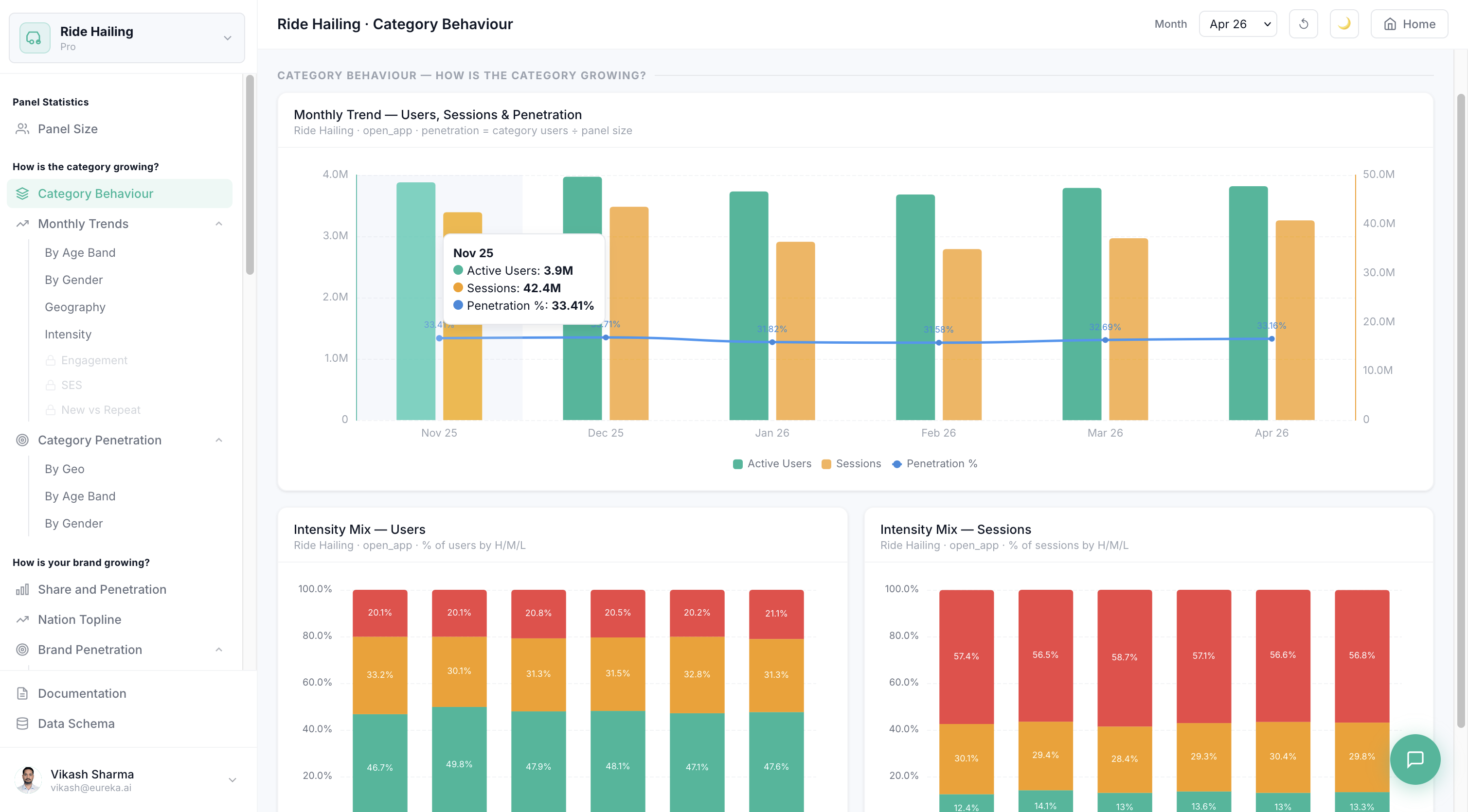
Tracks overall category health across six months: total active users, session volumes, panel penetration %, and the Light / Medium / Heavy intensity split that reveals whether growth is broad or concentrated. Sliced by age band, gender, geography (top regional areas), and engagement intensity so you can see exactly which demographic or regional pocket is driving momentum.
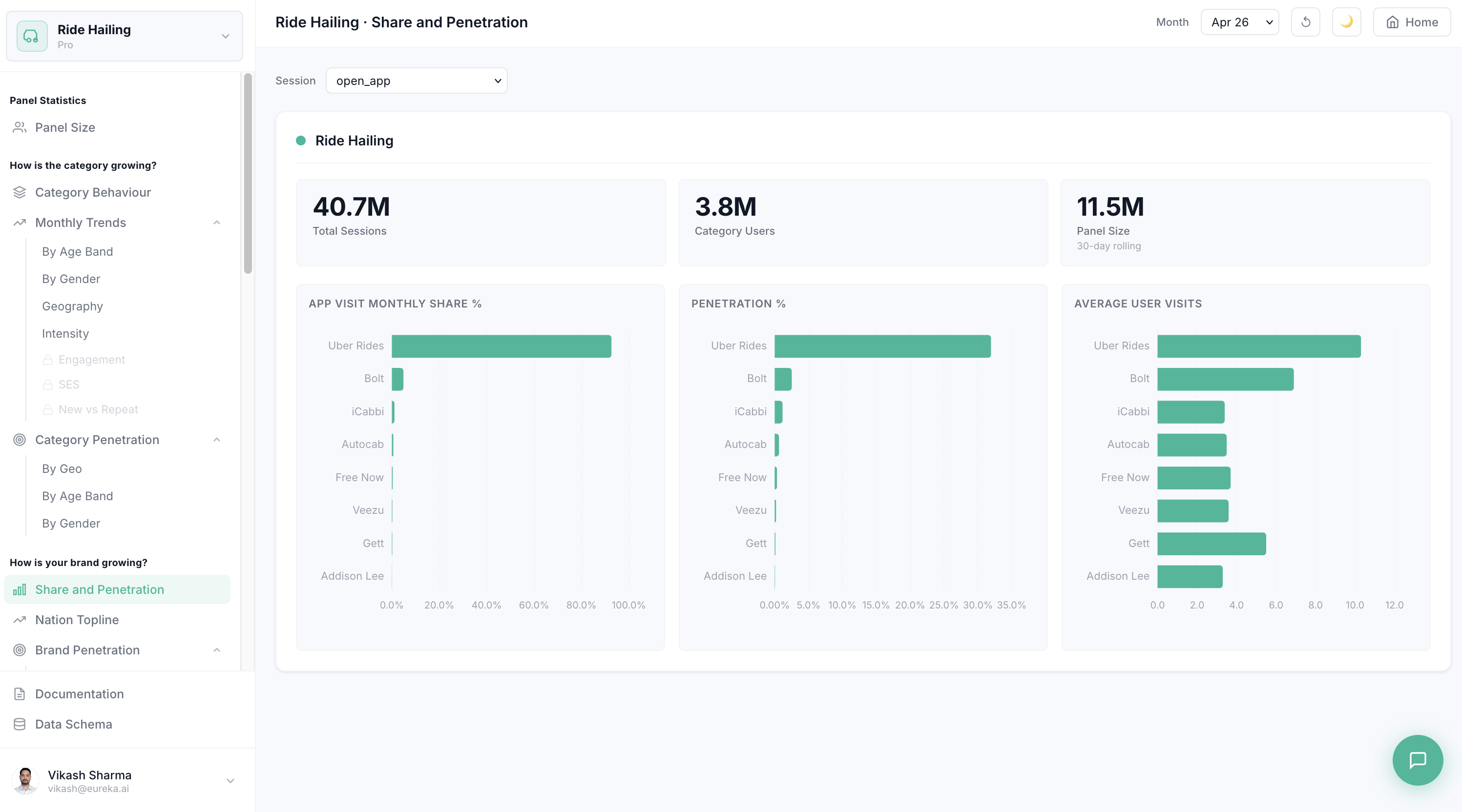
Positions a brand within its category using the Double Jeopardy Law — brands with higher penetration will always have higher loyalty too, so the question is how fast you are moving up the penetration curve. The Share & Penetration view ranks all brands side by side on monthly share, penetration %, and average user visits. Nation Topline and demographic breakdowns show where a brand is over- or under-indexing relative to the category.
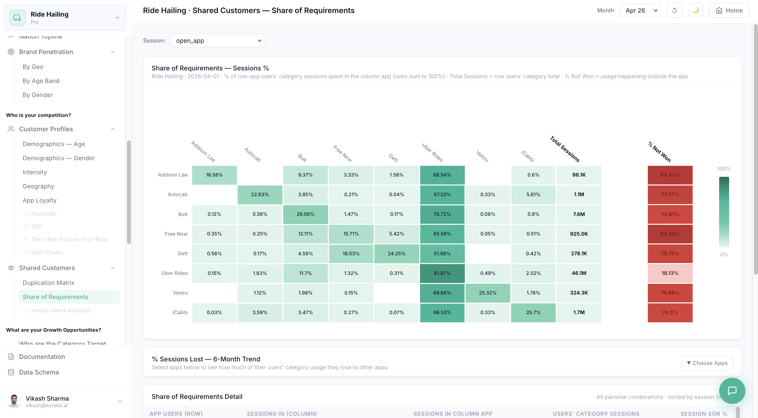
Maps the competitive landscape through two lenses: customer profile overlap (which demographic cohorts do rival brands share?) and session flow (what share of the category's total sessions is each brand winning or losing?). The Duplication Matrix shows what % of each brand's users also use every other brand. Share of Requirements quantifies the session leakage — what is going to competitors and what is % Not Won from the total category opportunity.
Identifies the segments where a brand is under-penetrated relative to either the full category or a specific competitor. The Category Target Audience view shows which demographic groups use the category but not the brand — the highest-value acquisition pool. Brand Target Audience narrows to segments where the brand itself is weakest. Penetration Targets overlays both to produce a prioritised list of reachable, high-opportunity cohorts.
Cross-references app users against social media channel visits to reveal which platforms over-index for a brand's audience versus the category average. The share gap — brand channel share minus category channel share — shows where a brand's users are disproportionately reachable, enabling precision media channel selection. A head-to-head compare mode shows how two brands' social footprints differ, identifying where a competitor has channel advantages worth closing.
Omni Growth outputs reach clients through two complementary channels — structured file reports for integration into existing data workflows, and a live interactive dashboard for self-serve exploration.
Pre-built category and brand intelligence reports are posted directly to a client-designated S3 bucket on a fixed cadence. Weekly snapshots cover session volume trends and top-line brand movement. Monthly reports include the full suite — penetration, intensity mix, Share of Requirements, App Loyalty distribution, and Social Channel Reach — pre-formatted and ready for downstream ingestion or stakeholder distribution without any manual extraction step.
The full Omni Growth web platform gives authorised users direct, interactive access to all 25 dashboard views across the five strategic question groups. Users can switch categories, change session types, adjust the reference month, paginate through geographic rankings, and compare brands head-to-head — all in real time without waiting for a scheduled report. The platform updates monthly alongside the underlying data refresh and is accessible via a secured web application with role-based access.
Live views from the growth intelligence platform — the dashboard environment that surfaces the data outputs documented in this product.
Omni Enterprise is built on three operator data streams — web traffic signals, physical foot traffic observations, and the cell site reference master. Together they provide the engagement, location, and geographic context needed to measure how subscribers use app categories across the network.
Network-observed app and web domain visit events for every subscriber in the panel. Each row is a deduplicated session-boundary event carrying SNI/DNS host name, transfer volumes, and session duration. Primary source for category classification, session-type assignment, and monthly active user counts. Rolling lookback: 6 months. Volume: ~1.25B rows/day · ~58 GB/day compressed · ingested daily, aggregated monthly.
{site_code}-{year_commissioned}. Foreign key to cell_id in the Cell Site Master for geographic resolution.TOKEN_ID links every web session to its corresponding foot traffic record for cross-domain subscriber journey analysis.Network-positioning pings indicating subscriber presence at physical locations, derived from cell site attachment events with dwell-time estimation. Cross-referenced with the Cell Site Master to resolve each ping to a named geographic area. Underpins all geographic dimension tables and penetration-by-region metrics. Rolling lookback: 6 months. Volume: ~2.5B events/day after deduplication (from ~8B raw pings) · ~37 GB/day compressed.
end_time − start_time = dwell duration. Stationary pings have equal start and end coordinates.start_longitude as the entry coordinate for the dwell window.start_latitude for stationary pings; differs for subscribers in motion (walking, slow traffic).CELL_ID in Source 01: {site_code}-{year_commissioned}. Foreign key to the Cell Site Master for geographic resolution and area code lookup.cell_site_id → postcode_area → regional district join chain through the Cell Site Master is the geographic backbone of every by-region output dataset.Authoritative mapping of network cell identifiers to named geographic areas. The join key that converts raw cell_id and cell_site_id values from Source 01 and Source 02 into the 126 regional area codes used across all geographic dimension outputs. Updated monthly to reflect network topology changes, new site activations, and boundary revisions. Coverage: ~500K sites · ~12 MB/month compressed.
{site_code}-{year_commissioned}. Matches CELL_ID (Source 01) and cell_site_id (Source 02). A single physical tower may have multiple rows — one per antenna sector.VALID_FROM_CELL BETWEEN valid_from AND valid_to to retrieve historically correct cell metadata.NULL means the configuration is currently active. Include valid_to IS NULL in production queries to select only live site records.4G-LTE, 5G-NR, 5G-mmWave, 3G-UMTS. Used to segment coverage analysis and benchmark engagement by network generation.cell_id + sector uniquely identifies a single beam direction at a tower.CELL_ID (Source 01) or cell_site_id (Source 02) → cell_id (Cell Site Master) → postcode_area → named district. Always use the point-in-time join (VALID_FROM_CELL BETWEEN valid_from AND valid_to) to handle cells upgraded or repositioned within the rolling 6-month window.Cost model built around the actual category pipeline: for each of 20 categories, identify relevant web URLs, find all MSISDNs who browsed them (50% of subscribers), pull their full web and footfall history, then aggregate daily. Each category runs independently — 20 separate scans totalling ~196 TB/day. BQ Enterprise Slots is the recommended compute platform — at $220/day (500 slots × 10hr) it is the most cost-effective option, 5.6× cheaper than BQ On-Demand at $1,225/day.
| Pipeline Step | Scan Volume | Daily Compute | Int. Storage / mo (retention window) | Annual All-in |
|---|---|---|---|---|
| Step 1 — Category URL taxonomy | 10 GB | $0.06 | — | $22 |
| Step 2 — MSISDN identification | 1.00 TB | $7.00 | — (~60 MB set) | $2,555 |
| Step 3 — Web day-agg (1 row/sub/day · 5 tables · 5× BQ compress) | 4.00 TB | $0 | $45/mo (12mo retain) | $536 |
| Step 4 — Foot day-agg (1 row/sub/day · 5 tables · 5× BQ compress) | 12.00 TB | $0 | $36/mo (12mo retain) | $429 |
| Step 5 — Category aggregation output | 1.60 TB | $0 | — (product output) | $0 |
| Slot reservation (BQ Slots) / vCPU overhead (Dataproc) | — | $17.60 | — | $6,424 |
| Annual All-in (compute + storage · no growth) | 18.6 TB/day | $18/day | $80/mo | $7.4K |
Annual total cost by compute strategy for the current slider settings. 20% data volume growth applied per year. 2026 reflects H2 only (184 days).
| Cost Line | 2026 H2 | 2027 | 2028 | 2029 | 2030 | 5-Yr Total |
|---|---|---|---|---|---|---|
| Pipeline compute (Steps 1–5) | $4.1K | $9.8K | $11.8K | $14.1K | $17.0K | $56.8K |
| Output & report table storage (BQ) | $0.05K | $0.12K | $0.14K | $0.17K | $0.21K | $0.69K |
| Weekly aggregation jobs (52×/yr) | $0.02K | $0.03K | $0.04K | $0.05K | $0.06K | $0.20K |
| Monthly aggregation jobs (12×/yr) | $0.01K | $0.01K | $0.01K | $0.02K | $0.02K | $0.07K |
| S3 delivery — report exports (weekly + monthly per category) | $0.09K | $0.11K | $0.13K | $0.16K | $0.19K | $0.68K |
| BigQuery Analytics Hub — listing admin | $0.10K | $0.20K | $0.20K | $0.20K | $0.20K | $0.90K |
| Total Annual Spend (Dataproc) | $4.4K | $10.3K | $12.3K | $14.7K | $17.7K | $59.4K |
All options run the same 5-step category pipeline and produce identical output datasets. The cost difference comes entirely from how each handles the 196 TB/day of per-step data reads.
| Compute Option | 2026 H2 | 2027 | 2028 | 2029 | 2030 | 5-Yr Total |
|---|---|---|---|---|---|---|
| BQ Enterprise Slots Recommended | $3.3K | $7.8K | $9.4K | $11.3K | $13.5K | $45K |
| Dataproc Serverless Arch. Alternative | $4.4K | $10.3K | $12.3K | $14.7K | $17.7K | $61K |
| BQ On-Demand High Cost | $14.1K | $33.9K | $40.7K | $48.8K | $58.6K | $196K |
| Dimension | BQ On-Demand | Dataproc Serverless | BQ Enterprise Slots |
|---|---|---|---|
| Cost basis | $6.25 / TB scanned | $0.04/vCPU-hr + $1.1/TB read API | $0.044/slot-hr (reservation) |
| Daily cost · 20 cats · per-cat mode | ~$1,225 | ~$236 | ~$220 |
| Intermediate storage · per category | ~$40/month | ~$40/month | ~$40/month |
| 5-year all-in total | ~$3.1M | ~$601K | ~$561K |
| Setup complexity | Low — pure SQL | Medium — Spark + orchestration | Low — SQL + slot quota mgmt |
| Scales with N categories | Poorly (N × 196 TB × $6.25) | Linearly (N separate Spark jobs) | Well (shared slots, SQL) |
| Verdict | Ad-hoc only | Alternative (Spark teams) | ✓ Recommended |
BQ Slots wins on compute — narrowly: 500 Enterprise Edition slots × 10 hours = $220/day. Dataproc costs $236/day (256 workers × 2hr × $0.04 plus 196 TB × $1.10 BQ Storage Read API). The $16/day gap, compounded at 20% annual growth, accumulates to ~$40K in savings over 5 years. Storage is equal across all options at ~$40/month per category. The two platforms are now near-equivalent on cost.
When to choose Dataproc instead: At only $16/day difference, the decision is less about cost and more about team fit. Prefer Dataproc if (a) no BQ slot reservation exists; (b) the team is Spark-native and values Spark orchestration; or (c) strict per-category job isolation via separate Spark contexts is operationally required.
BQ On-Demand is not for production: 196 TB/day × $6.25 = $1,225/day — 5.6× more than BQ Slots. Over 5 years: ~$3.1M vs ~$561K for BQ Slots — a ~$2.5M difference. Reserve for ad-hoc exploration only.
Eight production datasets covering category growth diagnostics, competitive brand intelligence, and social channel reach. All datasets are derived from live network observability data, refresh monthly, and are queried directly via the shared BigQuery environment — no ETL or data movement required.
Daily reference table tracking the total number of mobile subscribers observed by the operator's network panel — overall and split by age band, gender, and geographic area. This is the denominator for every penetration metric on the platform: when a category shows 33% national penetration, it is measured against the total panel universe from this table. The panel extends further into the future than the behavioural tables, so the newest months may show panel-only rows without a corresponding category line.
rolling_30d_unique_customers — not a SUM. Use DATE_TRUNC(visited_date, MONTH) to group by month.overall (total network panel), age_band (panel by age group), gender (panel by gender), postcode_area (panel by geographic district). Filter to overall for the headline panel denominator.overall: always 'all'. For age_band: 18-24, 25-34, 35-44, 45-54, 55-64, Over 65, Unknown. For gender: M, F, U. For postcode_area: 126 regional area codes mapped to named geographic districts.AVG(daily_unique_customers) across a month for a stable estimate of the typical daily active panel.visited_date. This is the canonical panel size figure. Take the month-end value (MAX(visited_date) within the month) as the denominator for penetration calculations. Note: rows are absent for October 2025 — penetration calculations must handle this gap explicitly.ARRAY_AGG(rolling_30d_unique_customers ORDER BY visited_date DESC LIMIT 1)[OFFSET(0)] grouped by DATE_TRUNC(visited_date,MONTH) where attribute='overall' AND attribute_value='all'. Join to category behavioural tables on month_id to compute penetration rates.Monthly category engagement metrics split by subscriber age band. Core table for tracking how a category's user base is growing across demographic cohorts over time. Each row represents one category × application × session type × age band × month combination. Filter to application = 'Any App' to get deduplicated category totals — a subscriber who uses both Uber and Bolt counts once, not twice. Summing individual-app rows will double-count multi-app users.
2026-07-01). All trend analysis joins on this field. Use DATE_TRUNC(month_id, MONTH) = DATE(@month) when filtering to a specific month.Ride Hailing, Food Delivery, Music Streaming). Consistent across all behavioural dimension tables.'Any App' for the deduplicated category total. Always filter to application = 'Any App' for category-level metrics — this is the pre-aggregated, deduplication-safe row. Individual app rows are valid for per-app analysis but must not be summed to produce category totals.open_app (app launched), login (authenticated session), commerce_intent (payment/checkout activity), transactional_activity (confirmed transactions), all_sessions (union of all types), driver_activity (supply-side activity where applicable). Use open_app as the default for general reach analysis.18-24, 25-34, 35-44, 45-54, 55-64, Over 65, Unknown. The canonical display order is this sequence. Unknown includes subscribers whose age could not be resolved from billing or enrichment data.application = 'Any App', this is the deduplicated count of category users in this age band. Divide by the corresponding rolling_30d_unique_customers from Dataset 01 (same month, same age_band attribute) to get age-band penetration rate.SUM(active_users) WHERE application = 'Any App' GROUP BY month_id, age gives the correct age-band breakdown of category users. Summing individual app rows inflates the count wherever subscribers use multiple apps in the same category in the same month.Monthly category engagement metrics split by subscriber gender. Structurally identical to the Age Band table with a gender column in place of age. Use to track whether a category is skewing toward or away from a specific gender over time, or to compare per-app gender profiles within a competitive set. Unknown (U) subscribers are included — this is a population statistics table, so unattributable slices are part of the picture.
'Any App' for deduplicated category total. Same deduplication convention as Dataset 02 — always filter to 'Any App' for category-level gender breakdowns.M (Male), F (Female), U (Unknown/unattributed). The underlying data includes all three values. Summing M + F + U across application = 'Any App' equals the overall active_users for that month and session type.application = 'Any App', deduplicated across all apps in the category.active_users to compute sessions-per-user — reveals engagement intensity differences between gender cohorts.active_users WHERE gender IN ('M','F','U') AND application='Any App' to Dataset 01 WHERE attribute='gender' matching on attribute_value = gender and month_id. The gender codes match directly between tables.Monthly category engagement metrics split by subscriber geographic area — one of 126 regional districts per row. Use to identify regional growth pockets, track whether a category's footprint is expanding geographically, or rank regions for location-targeted campaign prioritisation. Geography trend charts typically use per-app rows (excluding 'Any App') rather than the deduplicated total, as individual geography rows do not double-count users — a subscriber in one district is counted in that district regardless of how many apps they use.
'Any App' for deduplicated category total. Geography trend charts typically exclude 'Any App' and sum per-app rows — note that individual app rows do not double-count geography.SUM(active_users) WHERE application != 'Any App' over a 6-month window, then retrieve monthly series for the top-N regions. Apply client-side pagination (15 regions per page) to avoid chart overload. The trend window is set client-side by slicing the full history to the last 6 months from the selected end month.Monthly category engagement metrics split by subscriber intensity tier — Light, Medium, or Heavy users. Per Byron Sharp's market growth principles, healthy category growth is primarily driven by Light users (the broad, occasional audience). This table enables clients to monitor whether growth is coming from Light-tier acquisition or Heavy-tier deepening. Classification is pre-applied in the source data; no threshold parameters need to be defined.
'Any App' for deduplicated category total. For intensity mix charts, always filter to application = 'Any App' to avoid double-counting multi-app users across tiers.transactional_activity only has Light tier data for Ride Hailing; login has no intensity rows at all — this is an upstream data characteristic, not a pipeline error.Light (occasional users), Medium (regular users), Heavy (power users). Classification thresholds are pre-applied at source. The canonical display order is Light → Medium → Heavy.application = 'Any App', the three tier rows sum to the category's total active users for that session type and month. Compute tier share as tier_users / SUM(tier_users OVER all tiers) for a given month and session type.application = 'Any App', group by month_id, intensity, and compute share as each tier's active_users divided by the month total. Render as a 100% stacked bar in Light → Medium → Heavy order. A growing Light share over time is the primary healthy-growth signal per market growth theory.Monthly snapshot of subscriber loyalty tiers within a category — Solus (used only one app), Dual (used exactly two apps), or Three+ (used three or more apps). Pre-classified in the source data. Shows how exclusively or promiscuously subscribers engage within a category and which apps attract the most loyal versus multi-homing users. An app with a high Solus share has an exclusive user base; a high Three+ share indicates the app is commonly used alongside competitors and may be a secondary choice.
'Any App' rows for per-app loyalty stacked bar analysis. Use application != 'Any App' when computing category-level loyalty distribution.all_sessions — this captures the full picture of multi-app usage regardless of session depth. Using open_app alone may miss transactional users who only appear in commerce signals.Solus (subscriber used only this one app in the category that month), Dual (used exactly two apps), Three+ (used three or more apps). Pre-classified at source — no threshold parameters to define.'Any App' and group by app_loyalty.application != 'Any App', group by application, app_loyalty, render as 100% stacked in Solus → Dual → Three+ order. For category-level distribution: sum active_users across all apps (excluding 'Any App') grouped by app_loyalty. The default session_type for loyalty analysis is all_sessions.Monthly cross-app user overlap matrix — the structural competitive intelligence dataset. Each row represents a pair of apps within a category and quantifies what fraction of App X's users also used App Y in the same month. Enables N×N duplication heatmap visualisation, share-of-requirements analysis, and identification of which competitors are capturing the most shared users. The diagonal (same-app pairs) is excluded from the raw data and is conventionally rendered as 100% client-side.
application_x and application_y belong to this category. Filter to a single category for within-category competitive analysis.open_app for broad competitive overlap, or commerce_intent / transactional_activity for transaction-level competitor intelligence.application_x's users also used application_y this month." Each app appears as application_x once for every other app in the category.application_x this month. The denominator for overlap percentage: overlap_pct = ROUND(SAFE_DIVIDE(active_users_xy, active_users_x) * 100, 2).application_x and application_y in the same month. SAFE_DIVIDE(active_users_xy, active_users_x) * 100 gives the percentage of App X's users who also use App Y.active_users WHERE application = 'Any App' in the growth tables. Use as the denominator for share-of-requirements: what fraction of the category audience is captured by the shared users of any given app pair.application_x users. Available alongside the equivalent _xy and _category variants for session-volume share-of-requirements calculations.application_x users. Use for deep-engagement share-of-requirements analysis.application_x and application_y, compute overlap_pct = ROUND(SAFE_DIVIDE(active_users_xy, active_users_x)*100,2) for each off-diagonal cell, then add 100% diagonal cells client-side. For share-of-requirements: SAFE_DIVIDE(active_users_xy, active_users_category)*100 shows the share of the total category audience captured by both apps simultaneously.Monthly cross-platform overlap between mobile app users and social media channels — measuring which social platforms reach a brand's or category's user base. Answers: "Which social channels over-index for my brand's users versus the category average?" and "How does Brand A's social footprint compare to Brand B's?" There is no session_type filter on this table — social channel visits are session-type-independent and the column is absent from this source.
'ALL Universe' for the full category-universe view (all users of any app in the category); use a specific app name (e.g. 'Uber') for per-brand channel analysis. The category's brand list is derived by cross-referencing distinct application_x values here against the active-user rows in the growth tables for the selected category.application_x and channel_y in the same month. Raw count — must be normalised to a share percentage before comparing across brands or against the category universe. Normalise as: share_pct = active_users_xy(channel) / SUM(active_users_xy OVER all channels) × 100.channel_y by application_x users. Complementary to active_users_xy — high sessions relative to users indicates the shared audience is highly active on that social channel, not just incidentally reached.month_id and application_x. For category-vs-brand comparison: fetch once with application_x = 'ALL Universe' and once per brand, normalise both to share percentages, then compute gap = brand_share_pct − category_share_pct per channel. A positive gap means the brand over-indexes on that channel versus the category average.Plain-English guide to all cost models, assumptions, strategies, and caveats across every product page.